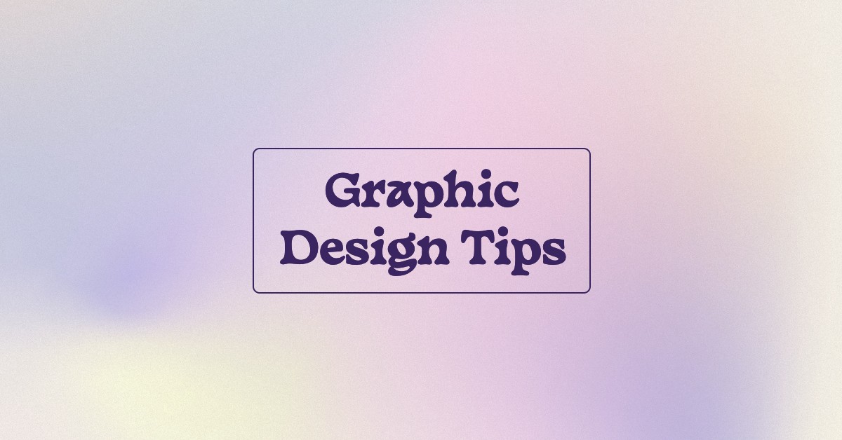

From the colors and images you select, to the overall mood, creating images like a pro is a bit more involved than you might realize. There are many elements at play in a professional-looking graphic design. Luckily, it’s possible to learn the skills it takes to create sharp, eye-catching graphics.
In this post, we’re sharing some effective graphic design tips to help you get started on your journey of creating images that will revamp your online presence and snag your audience’s attention.
1. Be Intentional About Alignment
Being intentional with the alignment in your graphic design matters to viewers. You don’t want an element of your design to feel like it’s a bit off. Errors in spacing and placement will be noticeable to viewers, even if they’re minor.
When you align your graphic design elements, you don’t have to stack things right on top of each other. However, they need to be lined up correctly whenever possible.
Spacing your design elements evenly, and in an aesthetically pleasing way, will go a long way toward helping your images look pro-level. These rules apply whether you’re placing shapes, icons, or text blocks.

2. Include Icons & Logos to Get Your Point Across
Well-placed icons and logos can make a significant impact on your branded graphics. In addition to using your brand colors and fonts, strategically placing a familiar icon or your logo will bring even more of your brand’s flavor to an image.
When it comes to including logos or icons in your graphic design—be strategic. Don’t try to squeeze a logo into an image just to force it in there. You want it to be large enough to read at a glance, and have enough breathing room around it to not feel cluttered.
Logos can work well on quotes or branded graphics, as well as YouTube video thumbnails. The trick is to make sure they are readable, identifiable, and make sense within the overall design.
If you include a logo, they often work well in either the bottom corner or centered at the top or bottom of your image.
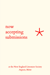
Icons can be leveraged well when included in tips, quotes, and infographics. Using a light bulb or lightning bolt to signify a great idea is a good example. Emojis can also help convey your message to your audience.
![]()
![]()
3. Leverage Contrasting Colors to Draw Focus
Using contrasting colors can help draw the viewer’s focus to where you want it. A properly contrasting palette can also ensure your designs are both aesthetically pleasing and accessible.
If you haven’t yet selected your brand colors, consider using a color wheel like Adobe’s free Adobe Color tool. You can use this tool to toggle between colors and choose a palette with the proper amount of contrast that is both true to your brand and attention-grabbing.
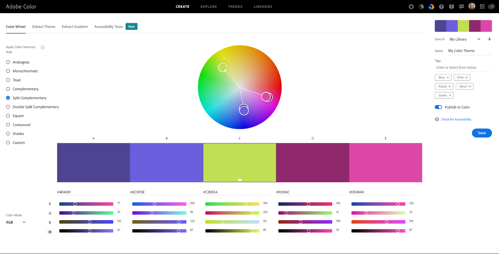

Adobe Color has recently incorporated a Contrast Checker feature that helps designers select accessible palettes that align with W3C®’s Web Content Accessibility Guidelines (WCAG). The tool also features a setting that can address three forms of color blindness for further accessibility.
4. Don’t Forget the Negative Space
When you design an image, you don’t want to cram it full of text, icons, logos, and a stock image until there’s no room left. That will make the design look too busy, and viewers won’t find it pleasing to look at.
The free space around graphic elements is considered negative space and it’s important because it allows you to create obvious groupings of information. For example, if two paragraphs of text were seen side by side without any negative space between them, it would be difficult to discern where one line of text ended and the other began.

A cluttered design also has the potential to stress out your audience, which will make them less likely to seek out your brand online. So when creating your graphic designs, make sure they have plenty of negative space. That way, you’ll keep your visual aesthetic looking tidy and pleasant.
5. Minimize Font Selection
Minimizing your font selection is just as important as honoring the negative space in your image.
Use clean, easy-to-read fonts that show up well against the background you’ve chosen. (If you can’t read them against your background image, consider using a solid shape like a circle, square, or rectangle behind the text as a sort of container.)


Refrain from using more than two fonts in your graphic design, excluding the logo or brand name you might include in the corner or at the bottom of the image. Even then, these fonts need to be in line with your brand style guidelines.
Don’t overuse formatting, such as bolding or italics. Font formatting applies to the two-font rule, as well. Otherwise, your image will be too busy and viewers might skip it, rather than read it through.
6. Consider Your Branded Colors & Aesthetic
When you’re creating graphics for your business, consider the branded colors and aesthetic you’ve chosen.
Your online presence should have a sense of consistency when it comes to your colors, aesthetic, and fonts. Graphics you create and share via social media should follow suit. You want to make sure the images you share align with your branding.
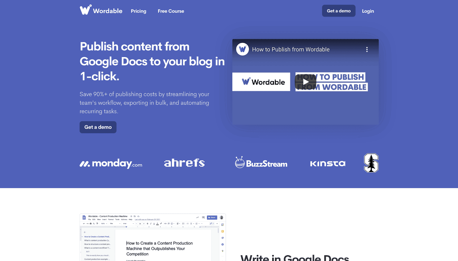
Take a look at Wordable.io. This brand uses cool, clean colors in its website design, so the color palette for its social media graphics would need to follow the overall aesthetic.

In contrast, see the Breadcrumbs.io color palette. Aesthetically, it’s extremely different from Wordable’s.
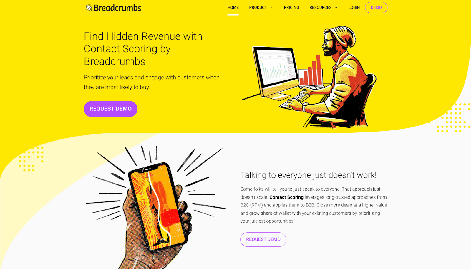

Using the bright yellow Breadcrumbs.io palette for Wordable’s social graphics wouldn’t work at all (and vice versa). It would present an aesthetic clash that’s inconsistent with the established brand palette.
7. Use Lines or Boxes to Keep the Image Organized
Using boxes, lines, or even shapes in your graphic designs works well to keep elements organized. Design elements like this help break up the text as well as elements of the overall image to draw the focus where you want it.

Adding lines or boxes is also a great way to create negative space as it keeps important information tucked away in one place. Just like with other design elements, you don’t want to overuse any of these approaches. Incorporate them sparingly and in a way that aligns with your brand design.
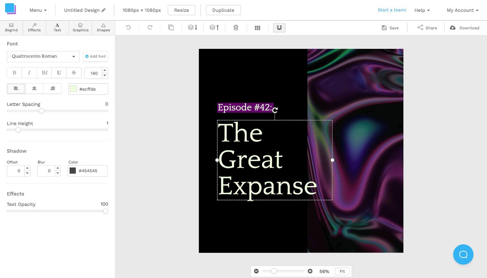
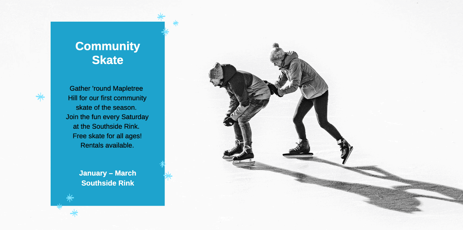
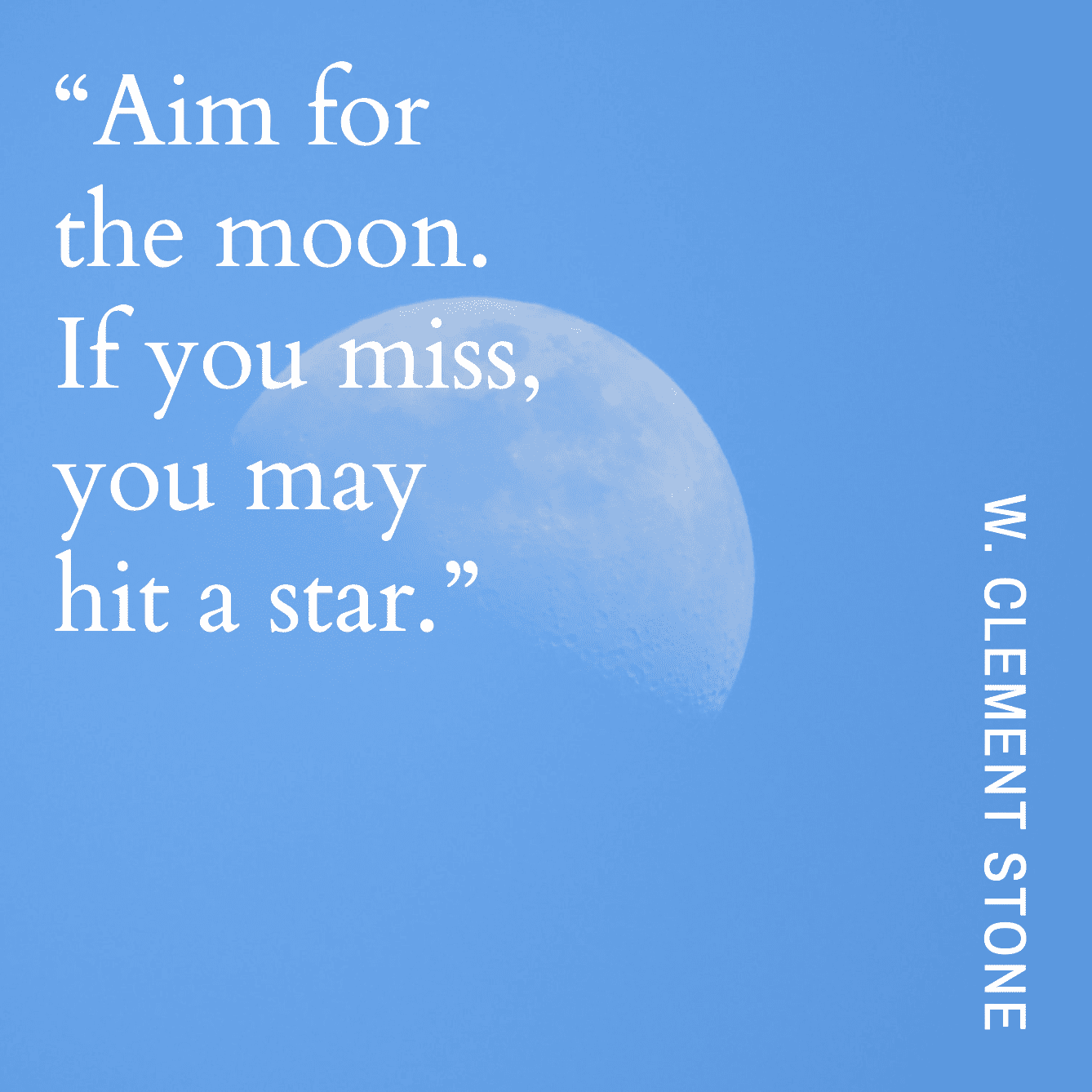
8. Test Different Styles of Alignment
While alignment is important in graphic design, not everything has to be perfectly centered. You can put logos in the corner of a graphic, or purposely break up text in an asymmetrical way.

The important thing here is to make sure that the graphics and visuals you choose look good and the information you have in your design is organized in a logical way. In the example above, the text is all left-aligned while the icon is aligned to the right. What makes this work is that all of the elements combined are centered within the boundaries of the graphic.
9. Adjust The Opacity of Elements
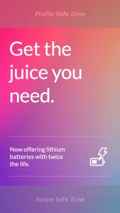
Adjusting the translucence or opacity of design elements can be very effective in graphic design.
For example, if the shape in the image below was completely opaque we wouldn’t see much of the subject in the photo behind it. Adjusting the opacity to at least a partial translucence gives you the contrast you need for your text to be readable but also allows for the background to come through. Striking this balance is crucial in creating a professional and high-quality graphic.


See more opacity tricks in our video below:
10. Remember Mobile
When designing images for your brand, don’t forget mobile.
As of 2021, more than 90% of the world’s internet users were on mobile. According to the same data from Statista, more than 56.89% of the world’s internet traffic is also running on mobile.
This means that optimizing your images for mobile users isn’t something you can ignore.
Are your images optimized for mobile viewing? Are they sized properly for different platforms in a way that will work on mobile, and is the text large enough to read on a mobile device?


Keep in mind that vertical images are more popular than horizontal on mobile. Left-aligned formatting may be the best option for readability, in a text-heavy post.
11. Keep It Simple
Finally, we saved the best tip for last: keep it simple.
Graphic designs are infinitely better when they’re kept simple, uncluttered, and clean. This gives the viewer a chance to skim information easily without feeling overwhelmed.

If you’re in the beginning stages of becoming a graphic designer, remember to take your time, and keep things simple from the very start. When you take a bit more time than normal to create thoughtful and well-planned designs, your followers are more likely to enjoy your content. Rather than clicking away from a poorly designed image, they’re more likely to come back to your brand for more.
Final Thoughts
Now that you’re equipped with some great graphic design tips, it’s time to get to work. With a little practice and commitment to designing with simplicity, you’ll be on your way to boosting your online presence, one graphic at a time.
Want help creating gorgeous designs that look professional even if you have zero experience? You don’t have to be a professional graphic designer to create images like a pro—and you don’t have to invest time and money into expensive software with a steep learning curve.
If you’re ready to start creating your own eye-catching graphics without a lot of fuss, take a look at Snappa. You can get started for free here.